


By Eugene Struthers

Colour is by far one of the most important elements of photography. It should be used with great care and understanding. In its purest form it can invoke and change the perception of an image and influence our "psychological" interpretation towards the image. Certain colours can grab our attention whilst others can calm us. Others may excite and stimulate us, influencing our perception and understanding of what we are looking at. Colour can give an image mood and a feeling of depth and atmosphere. Each colour has its own character and individual affect upon an image. Some colours have a stronger presence than others and this will create a more powerful response from the viewer.

When light interacts with matter, the strength of the interaction depends on the colour and energy of the light.
We know that white light is composed of electromagnetic energy of different wavelengths. So when white light enters a prism, the different components interact with the different strength levels of energy. These different kinds of light colours have different "wavelengths". Each type of light is more sensitive than the other, each travelling at different speeds, bands and densities. These can be short, medium or long wavelengths of light energy. Each with its own character. Our eyes can sense these different characteristic wavelengths and we see this as colour.
However; when the white light enters a prism it is slowed down, each kind of light within the white light is refracted at different angles, dependent on its level of energy and the strength of the different wavelengths.
This then separates all of the colours. Each colour is refracted to a different degree by the glass. As the colours pass through the prism they are dispersed into a spectrum of light. If we replace the prism with water droplets in the atmosphere of the air. As light passes through the moist water droplets. The water droplets act like a prism. This causes the colours of light to separate into what we call a rainbow. To change the spectrum of coloured light back into pure white light. All we need to do is introduce another prism. This will reverse the whole process to create white light again.


What is a spectrophotometer.
An optical spectrometer (spectrophotometer, spectrograph or spectroscope) is an instrument used to measure properties of light over a specific portion of the electromagnetic spectrum.
How does it work?
A spectrophotometer is an instrument that measures the amount of photons (the intensity of light) absorbed after it passes through a sample solution. With the spectrophotometer, the amount of a known chemical substance (concentrations) can also be determined by measuring the intensity of light detected.
What is a spectrophotometer and what does it measure?
The spectrophotometer is an instrument which measures the amount of light of a specified wavelength which passes through a medium. According to Beer's law, the amount of light absorbed by a medium is proportional to the concentration of the absorbing material or solute present.
How a Spectrophotometer works.


The Tristimulus values are the main indicator measurements but there are other factors which can influence how colour is perceived. These can be altered by a variation in the quality of light, the actual source of the light, its angle of view, its field of view. The tristimulus values give a reliable system that provides us with a guide, and a measurement point of reference. So that manufacturers and customers have a way to communicate colour preferences in order to ensure a consistent and precise colour matching standard of compatibility.
The Spectrophotometer replicates the sensor in our eye to measure colour values. These values are then repeated for consistency and colour quality in product development. Similar in process to the human eye, the Spectrophotometers rely on a system of three colour values which are called the tristimulus values. The tristimulus values measure light intensity based on three primary colour values (RGB), these are represented by X, Y and Z coordinates. This system is the foundation of colour language and is often referred to as the CIE colour system. It is used to deliver universal precise colour values worldwide.
sRGB:- Is the colour space produced by Hewlett-Packard and Microsoft in the late 90’s. It became popular with all mediums such as monitors, cameras, scanners and printers. SRGB has the smallest range of tones and colours (approx 35% of the full International Commission on Illumination (CIE) range, out of three most popular colour spaces. It is widely used as it is supported by all image software, monitors and cameras. If you need to keep things simple and avoid colour shifts when editing and sharing your images. This colour space option would be your safest option.
Adobe RGB (1998):- As the name implies. This colour space was created by Adobe in the late 90’s and was utilised for full colour management in their photoshop editing software. As a result of its wide use and support. It quickly became popular and extensively supported. The Adobe colour space, is a wider colour space than the sRGB, it encompasses around 50% of all visible colours as defined by the CIE. It is the preferred choice for editing in 8-bit or 16-bit modes and carries a lot more colour information for printing. However; it does have its own negative drawbacks.
1) Adobe is not supported by all browsers. If you images are intended for the web - online. Your audience may see your images in slightly different colours if they are in Adobe RGB colour space.
2) You will require special software to uncompress the colours. As adobe RGB compresses colours and special image software will be required to expand and uncompress all the colours back into a full gamut. You will require Adobe software to view and edit your images. As other software programs do not support this type of colour space. The resulting image will be dull and the colours could appear muted in tone and balance. If you are editing images using Adobe software, you should remember to convert your images into sRGB. So that others can see the image in its full potential.
3) If you decide to send you images to a print lab. Most print labs work in sRGB colour space, unless they specifically specify a different colour space format. This will mean that your images colours will appear incorrect and dull. Check with the print lab what colour space format they print with. As they may require you to change the colour space profile you use.


ProPhoto RGB :- This was created by Kodak for advanced image reproduction on print. The colour space covers the largest range of colours and even goes beyond what the human eye can actually see. To achieve this range the photography must set his camera to a RAW format and open the RAW file (the digital negative) in 16-bit mode. If this is done in 8-bit mode you will more than likely run into banding and posterization problems because with only 256 levels per colour channel in 8-bit mode, the gradient steps are larger. And you will not be able to save the file as a jpeg because it only supports a 8-bit mode. You will have to save the file in a format that supports 16 bit such as PSD or TIFF and your printer will have to support this format as well. This colour space is recommended for photographers who shoot for a specific workflow and print on high end inkjet printers which has the ability to accommodate and facilitate these high range of colours.

Editing techniques
To give you an indication of how important colour is to photography and how we edit and structure our final image. I have put together a few tutorials to fully illustrate how colour can influence the final results.
1) How to correct the colour balance in your images. Click here
2) How to correct the mid-tones in our images. Click here
3) Colour to Black & White conversion. Click here

A list of filters. Click here (How filters influence colour)
This will be covered in the advanced photography course.
Basic colour mixing

Additive colour mixing
RGB
Red + Green = Yellow
Red + Blue = Magenta
Green + Blue = Cyan
Red + Green + Blue = White
Subtractive colour mixing
CYMK
Cyan + Magenta = Blue
Magenta + Yellow = Red
Yellow + Cyan = Green
Cyan + Magenta + Yellow = Black
What is the difference between CMYK and RGB?

If you intend to use a digital printing method, the printer will print colour on to paper using CYMK colours. The mode uses the colours CYAN, YELLOW, MAGENTA and BLACK. It is known as a subtractive process, which basically means that when each additional colour is added, more light is removed and absorbed. When we add the three first colours together, this creates a more dark brown cast. The K colour or black is used to completely remove light from the printed image. The human eye percieves this dark brownish colour as black.

The human eye
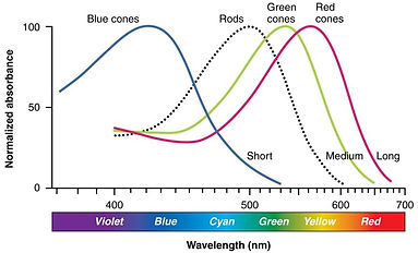
The human eye has three different types of colour-sensitive receptors, called cone cells. On closer microscopic inspection of the human eye, the retina is made up of two types of light-sensitive, rods and cones. The rod cells are best at "scotopic" or low light level night vision, whilst the cones are best at "photopic" or high light levels or high-resolution colour vision. The cones can receive short, medium and long wavelengths. Commonly known as the blue, green and red receptors. They can receive different wavelengths of light. 1) Short - Blue, 2) Medium - Green, 3) Long - red. We can see colour once these receptors are stimulated.
And we have three values to describe these colour sensations. The three values are called the "Tristimulus values" of a colour. They are a measurement of the relative sensitivity of each light source needed for our eyes to sense a specific colour. The tristimulus values are usually represented in X, Y and Z values of the CIE space.
In 1931, the International Commission on Illumination or CIE, which is the abbreviation for its French name, Commission internationale de l'éclairage, established the first system for scientifically defining light colours or additive colours.
The CIE used the data produced by Wright and Guild to develope the CIE Colour System or CIE XYZ colour space. It was the first widely accepted, International standard way of defining colour and is still the "gold standard" today.


Tutorial:- Colour printer management:- Click here
This will be covered in the advanced photography course.

The RGB colour mode is mostly associated with that of electronic displays, such as CRT, LCD monitors, digital cameras and scanners. It is an additive process of adding the main primary colours RED, GREEN and BLUE togther to create a variety of different colours. Once we combine all three of these colours together the result will create a pure white colour. Software such as photo editing programs use RGB colour mode as it offers the widest range of colours for image manipulation.
